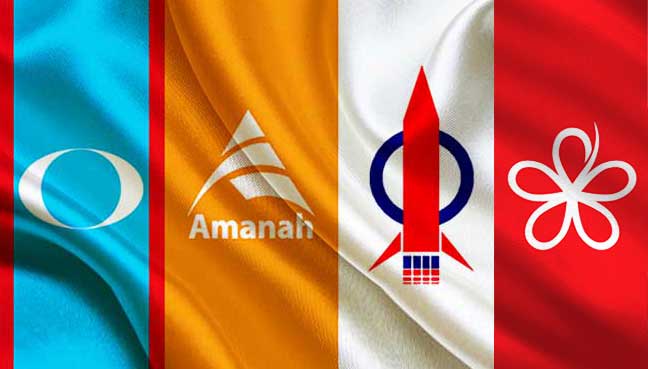
Following widespread ridicule of its proposed logos, PH now wants the people to come up with one that symbolises ‘hope’, ‘democracy’, ‘unity’ and ‘justice’.
PETALING JAYA: A day after social media users poured scorn on the proposed logos for Pakatan Harapan (PH), the opposition coalition today invited the public to come up with alternative designs.
In a statement today, the coalition said it took note of all the criticisms and the suggestions.
“After taking into account the public feedback and that of the PH leadership, we are welcoming alternate designs by interested parties.”
The coalition went on to state that the logo must comprise two colours and must use an easily recognisable symbol.
The rationale of the logo must revolve around “hope”, “democracy”, “unity” and “justice” among others.
Yesterday, Twitter and Facebook users ridiculed all three logos, which were posted on PKR vice-president Rafizi Ramli’s Facebook page.
PH had hoped to adopt one of the three logos as the common one to be used by candidates from its member parties, in taking on the “dacing” of Barisan Nasional (BN) in the next general election (GE14).
Two of the three logos contain the word “HARAPAN” with rays radiating outwards from the word. These two logos with the same designs, however, used different fonts and background colours – one background in orange and the other in red.
The third design incorporates a “thumbs up” sign against a red and white background with the words “PAKATAN HARAPAN”.
Some social media users criticised the designs and choice of colours, saying the red and white were too similar to the colours of BN’s Umno and newest Pakatan Harapan member Parti Pribumi Bersatu Malaysia (PPBM).
Others pointed out that orange was the colour of Amanah, another Pakatan Harapan member party, and said the pact should go for a more neutral colour.
PH called for its supporters to submit their designs to [email protected], with the deadline being 10am Tuesday (May 9).
Designers must include their names, IC number and telephone number.


